HOME PAGE
The home page focused on 3 main products from each main category, laptop, desktop and print. The last screen became a way-finding experience if users didn’t interact with the navigation.
HP LOOKBOOK
The LookBook was beta site curated with premium HP products. It served as a pilot for new navigation, streamlined user flows, and a new airy aesthetic in order to give users an effortless experience.
The home page focused on 3 main products from each main category, laptop, desktop and print. The last screen became a way-finding experience if users didn’t interact with the navigation.
In order to create a visually simple yet robust navigation, I utilized imagery to help users decipher form factors. They could also shop by use or deals, or see everything available.
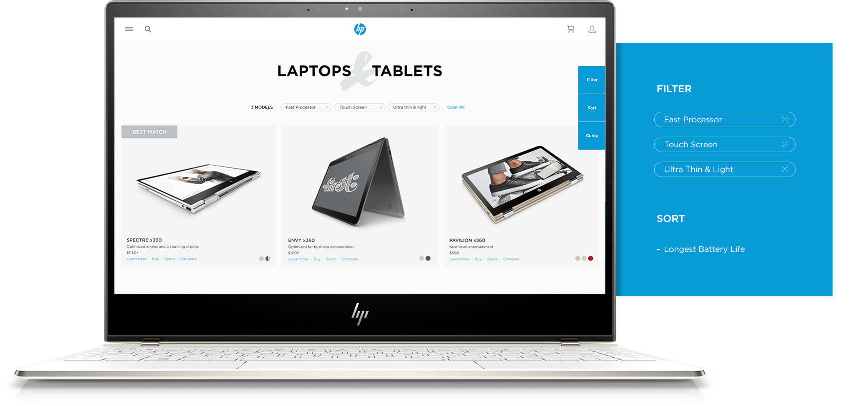
The category page was visually simple, yet functionally robust. Users could filter using their own language, whether that be “fast processor” or “Intel Core i7”, sort by features such as “best battery life” or be guided through a series of simple questions to get them to their best match.
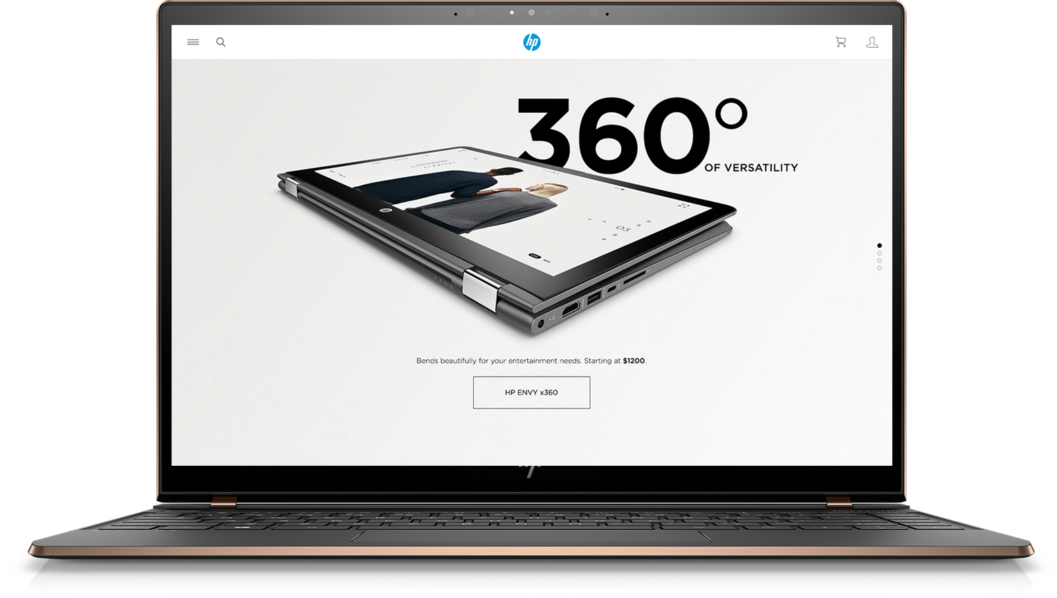
The product detail page contained a comprehensive visual story of the details that make the product beneficial to the target user.
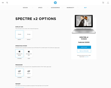
To eliminate SKU complexity, I created a configurator so users could easily choose their options without having to look at multiple sets of tech specs.